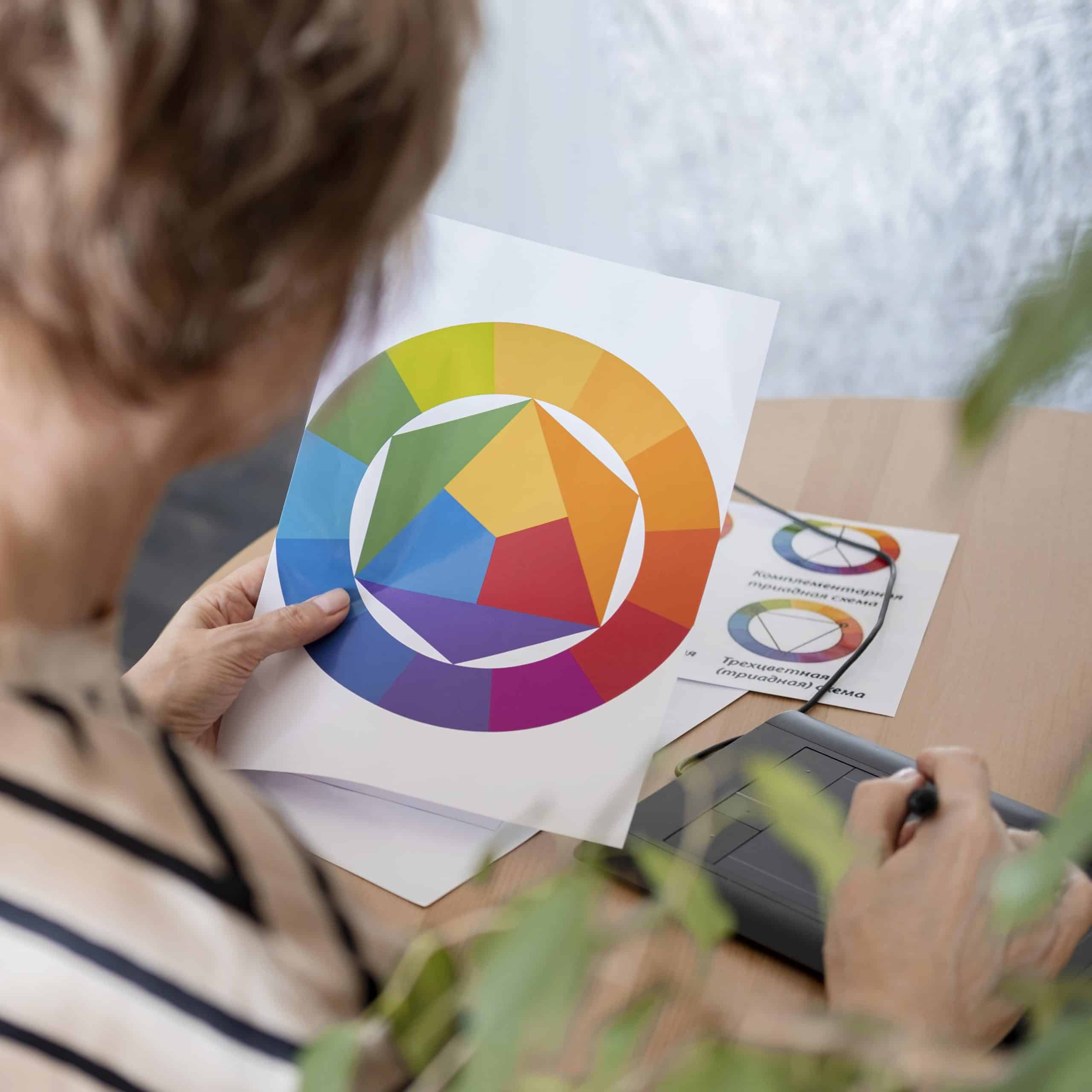
With online shopping taking the world by storm, users are subjected to hundreds of brand product photos daily across e-commerce websites, social media, or casual internet browsing. Whether your brand sells skincare, cosmetics, or fragrances, making your beauty product photography stand out in this online clutter is more complex than capturing aesthetic shots. From lighting to props to colors, a lot goes behind every great beauty product photo that influences nearly 75% of online shoppers‘ buying decisions.
But one aspect of photography that directly taps into consumer emotions and shapes their perception of a beauty product has to be color! Delve deep into color psychology and its importance in creative photography with the G Story.
What emotions can different colors generate during a beauty product photoshoot?
Every color can convey various meanings and emotions, depending on how it’s used and the context of the image. Here are some ideas:
- Red: Red is a powerful and attention-grabbing color that exudes passion, boldness, confidence, sensuality, elegance, and luxury when used in cosmetic product photography. In other contexts, it can also evoke warmth and comfort.
- Pink: Beauty product photography is incomplete without pink, often associated with femininity, softness, love, and nurture. It can convey a gentle and delicate image, making it suitable for products like personal care, make-up, and perfumes targeted at a female audience.
- Purple: To bring out royalty, luxury, tranquility, and femininity, soft purple hues such as mauve and lavender are the right choice. On the other hand, electric purple hues in creative photography can give a bold and unconventional look and feel.
- Blue: Blue reminds us of nature as it is the color of the ocean and sky. Calmness, peace, purity, trust, and refreshment are some of the feelings that customers may feel when blue is integrated into cosmetic product photography.
- Green: Another color found abundantly in nature, green can bring vitality, freshness, serenity, health, growth, sustainability, and youthfulness. A typical example is green plants used as beauty products photography props when shooting for organic beauty brands.
- Yellow and orange: To invoke feelings of optimism, happiness, hope, warmth, and youthfulness, the hues of yellows and oranges are the perfect choice! Soft, muted shades of yellow, like pastel yellows or pale gold, can convey a sense of elegance and luxury, ideal for high-end beauty products.
- Brown: Brown is widely used in natural beauty products photoshoots to showcase organic, earthiness, and well-being. When used for fragrant products, it evokes warmth and comfort, while for high-end cosmetics, it conveys sophistication.
- White: In skincare and cosmetic product photography, where qualities such as purity, class, luxury, and innocence need to be highlighted, white is the color you can rely on.
- Black: Black represents power, authority, sophistication, elegance, luxury, and confidence and is timelessly used for high-end beauty products photoshoots.
What is the 3 color rule in photography?
Using models is one of the most popular beauty product photography ideas. The G Story has an insightful tip to share to take these photos to the next level. All you need to do is apply the 3-color portrait photography rule, where you work with three core colors: the model’s skin tone, attire, and background. Using this approach, you can choose a cohesive color scheme and harmonizing composition that ensures your beauty product remains the primary focus of the photograph.
Explore beauty product photography ideas.
While theory will equip you with knowledge, it’s not until you see it that you will truly understand what goes into beauty product photography. The G Story has worked with global as well as homegrown beauty brands! Our extensive creative photography portfolio can be one of your best sources of inspiration. Before you go, if you need to tell a story about your brand, we’re just a message, email, or call away!

